To create a unique brand identity for Bangalore-based real estate brand Arun Shelters. Arun Shelters has been in the Bangalore real estate industry for more than a decade. Their portfolio spans more than 40-50 acres of land bank in North Bangalore. Their aim was to establish themselves as a strong contender in the competitive real estate market. They also had huge plans of aggressive growth in the next 3-5 years and they wanted their logo to depict growth.
Bangalore, as the burgeoning IT sector that it is, has a huge demand for real estate. And the same can be said for the supply. The need to stay unique is huge and very challenging. Thus, as the way forward we designed a strong logo unit and an appealing brand language which reinforces the heritage behind the 10 year old brand along with its modern sensibilities. Here are the three things we devised to make the logo and thus the brand stand out.
1. A for Arun shelters
2. An upwards arrow in the negative space of the logo unit
3. A hut for constructions & real estate
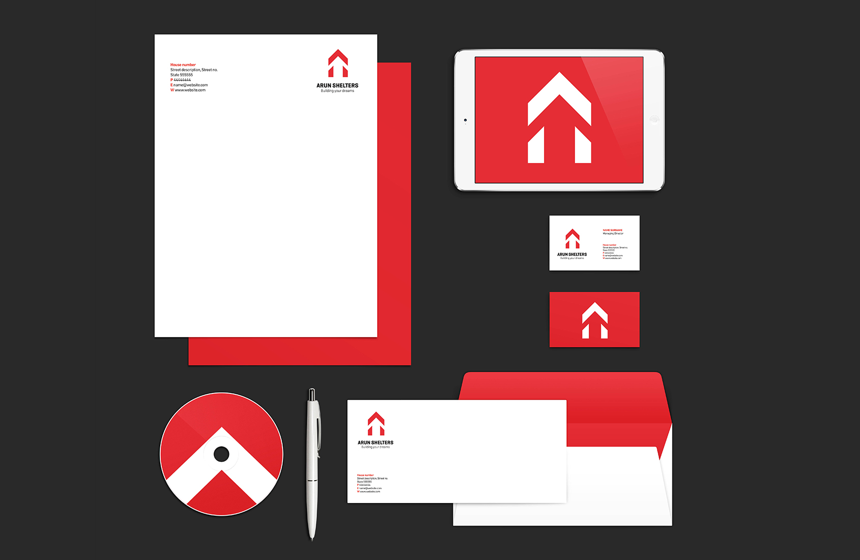
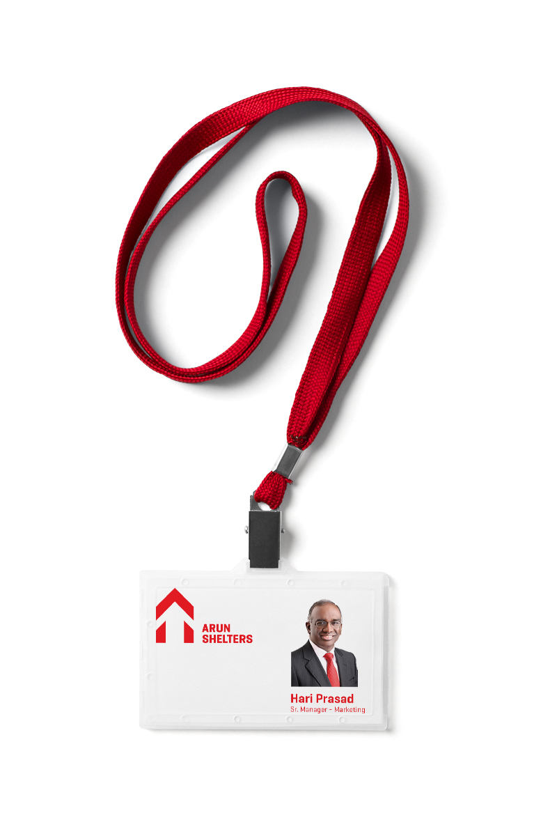
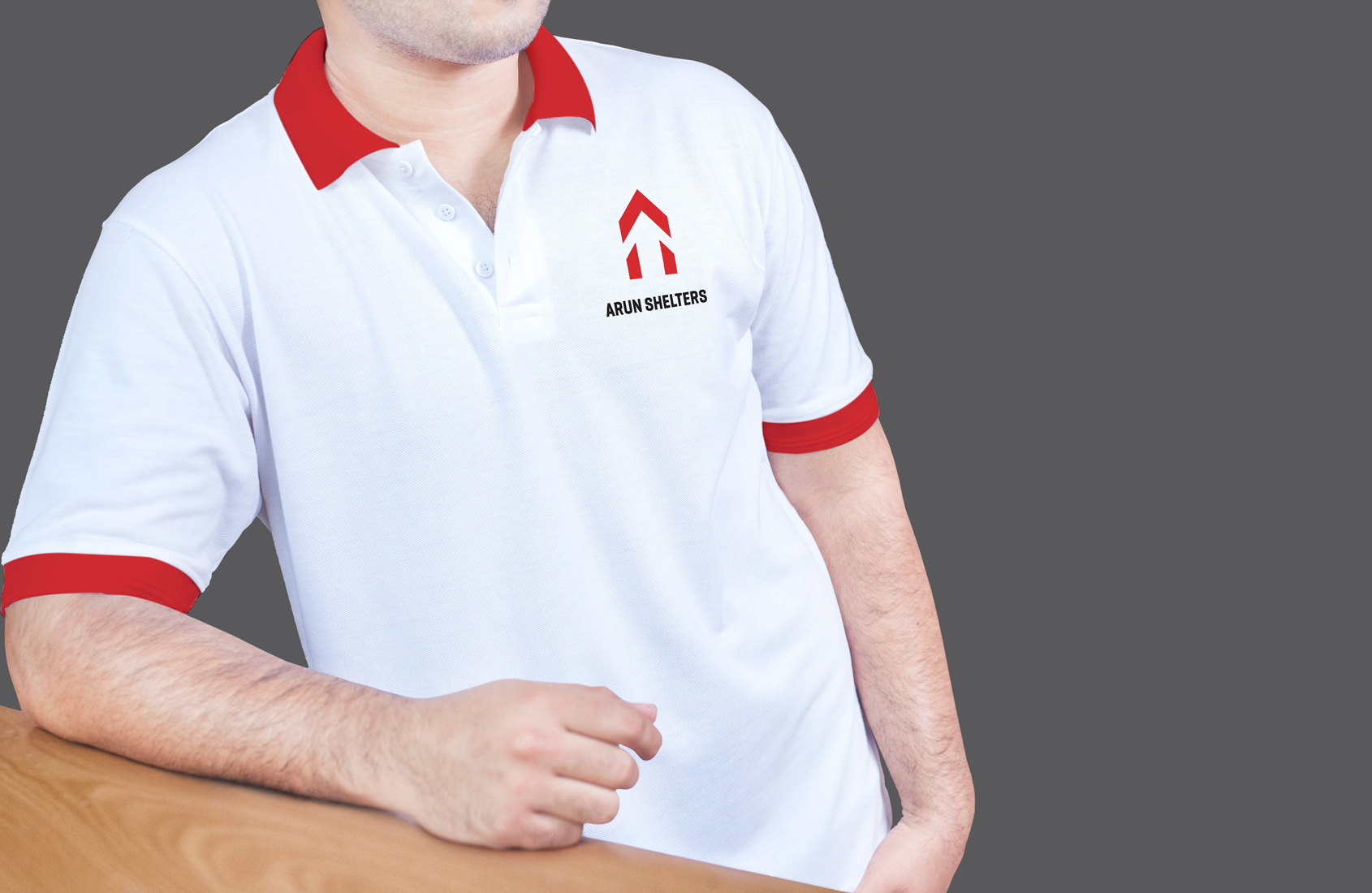
The logo hit the bull’s eye for its simplicity in execution. It’s red and white variants managed to stand apart amongst the clutter and ignited the consumer’s curiosity.