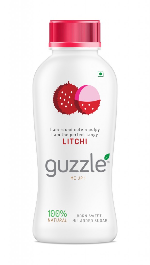
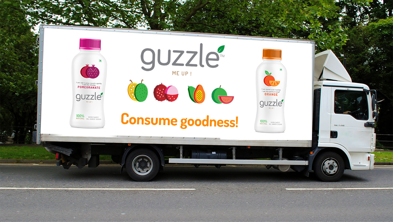
‘No-sugar-added’ fruit juice flavours that are as tasty as they are healthy. The brief was simple – how to tell the consumer that fruit juices without sugar can be naturally sweet, thus retaining its inherent flavor and health benefits. The product offered the following flavours – papaya, jackfruit, litchee, and more. Our job was to name each product and position Guzzle as a juice brand that offered the best of both worlds – good health and great taste.
We understood that Guzzle is a no-nonsense brand. It had something important to give and required us to say it right. Thus, our design inspiration came from the product itself – simple, honest and minimal. The bottle packaging featured clean illustrations of the fruit it contained along with copy that conversed with the consumer from the word go. The packing was designed to live up to the brand’s promise of fruit juices that can refresh and rejuvenate the drinker without adding calories during the intake.
David Ogilvy has famously said, the consumer is not a fool. This truism has outlived the man who penned it as we saw from the collective response of the consumers. The clean copy and lean design spoke to the consumer directly and without any frills. Thus, re-affirming our faith in design that echoes the product.


