In this sophomore essay, we look at how packaging design is a great branding exercise and if done well, can positively benefit your brand.
If what you’re selling is important,
what you’re selling it in is too.
A couple of months ago, we discussed the basics of packaging design and why it is essential for every brand to consider product packaging as an important assignment. In this essay, we dive deeper into the outrageously creative world of packaging design and how you can gain the upper edge through smart, creative and sensible packaging.
Be it a packet of chips, a can of soup or a Tetra Pak of juice, packaging design plays a significant role in impressing the customer well enough to make them buy your product. What we’re going to discuss in this essay will help you understand the need for better and smarter packaging design so that your anti-dandruff shampoo doesn’t end up on a supermarket aisle looking just like the hundreds of other anti-dandruff shampoos on the same aisle.
The juice box problem

What are you selling?
Who are you selling it to?
Where can they buy it from?
In our inceptive blog on packaging design, we provided the aforementioned essential questions that will help any brand get started on the process. The FMCG market is one the best segments to explore and learn about packaging design. Take juices for instance. Until the late 1980s in India, juices were traditionally packaged in bottles – plastic and glass. Since then, juices or consumable liquids for that matter have always been packaged in Tetra Pak boxes. While international expansion of Tetra Pak had begun in the 1960s, it took almost 3 decades for it to reach and decisively conquer the Indian market.
In today’s supermarkets, you’ll find aisle after aisle of Tetra Pak boxes. When a customer is facing such an aisle choosing a beverage is going to be difficult. It’s no secret that if you’re selling beverages, your packaging options are going to be limited. Juices can’t be sold in pickle jars or tin cans. When Paper Boat was ready to launch their range of beverages, they found a solution to this problem.
Paper Boat’s solution
When beverages were systematically sold in Tetra Pak boxes and plastered with orange, red, green and other fruity colours, Paper Boat found their calling in the purest of all colours, white. They also did away with the boxes and chose a sachet with a cap, doing away with the customary straws and making the package useful. While Paper Boat’s branding campaigns began attracting nostalgic customers to their products, their packaging attracted the supermarket shoppers by looking different.
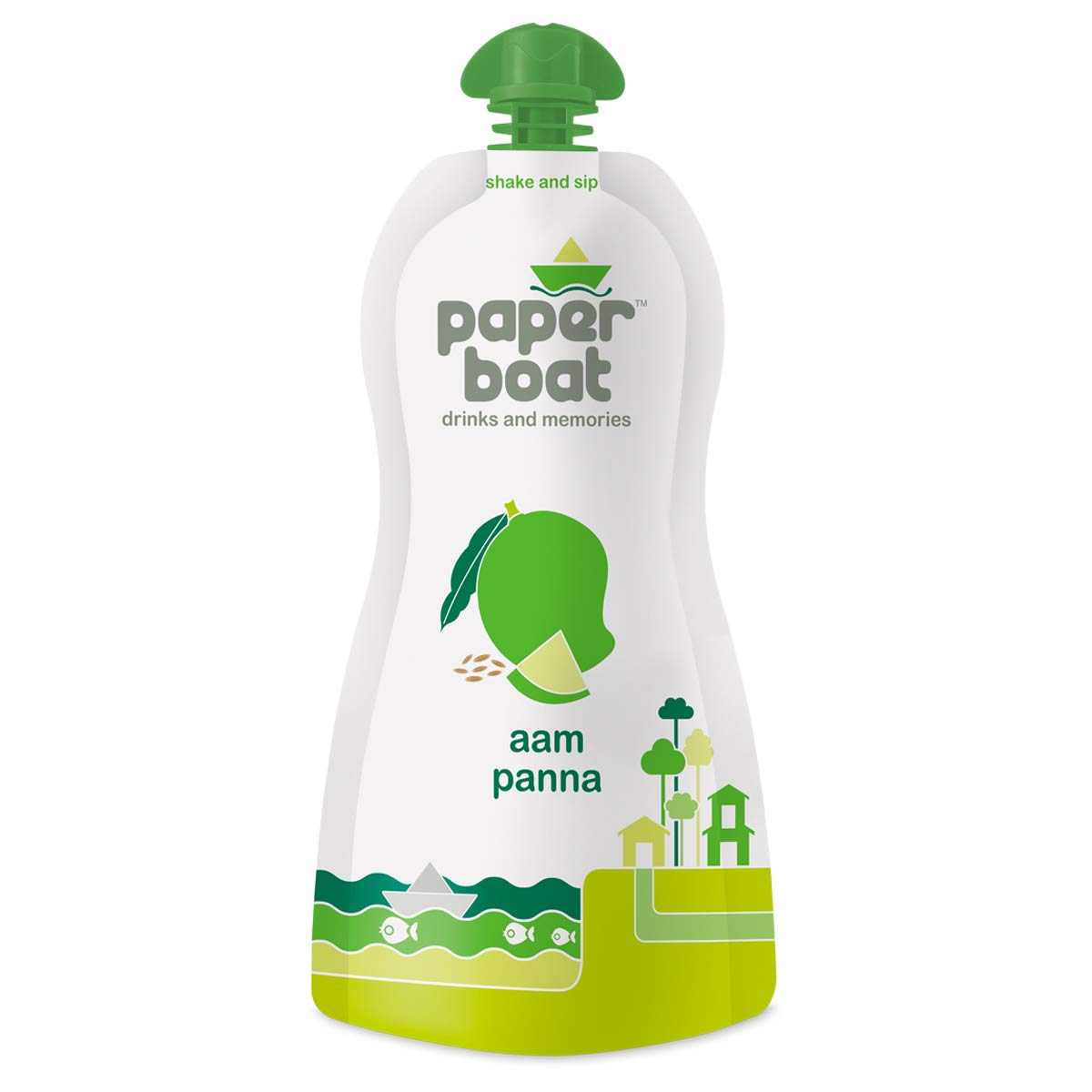
What Paper Boat did was a stroke of creative ingenuity. When everyone else was packing their juices in a box, the brand chose a sachet. It must be noted that Paper Boat had to rely on the Tetra Pak box to sell the 1l size variant of their juices as the humble sachet couldn’t hold larger quantities.
Price and packaging
If you’re Swarovski, you’ll need to find the grandest looking container to pack your products in. If you’re an upmarket juice brand, splurge not just on the material but also on the design elements. Make it an experience. Remember, price and packaging go hand-in-hand.
The mundaneness of reusability
While a majority of products carry signs such as “dispose after use”, “crush after use” and “recycle after use”, there are a growing number of brands who design packaging with the intention of reuse. These brands provide a truly unique experience through packaging to the customer. They place an inherent value on reuse. If you received your shoes in a nice looking box, wouldn’t you want to hold on to that box? Take a look at the box designed for Puma below. Wouldn’t you want to hold on to this one?

In India, reusability is widespread. For decades, containers – be it plastic or glass, are being reused for storage (of pickles or pulses). The later generation found Snapple’s distinctive glass bottle to be reminiscent of juice containers from the 1970s and reuse the bottles for storing and consuming homemade juices.
The modern consumer is best known for notoriously reusing the Starbucks coffee cup at home or work, over and over again. While these are good examples of reusable packaging, they merely skim the surface as to what brands can do.
Let’s talk about instant noodles. Brands like Maggi and Top Ramen sell their products in a thin layer of coloured plastic.
While the brands have alternatively begun using plastic cups, the packaging is always up for disposal. If you’re launching a line of instant noodles, would you consider a plastic wrap or a cup? Or would you choose to do something different? Picnic, a relatively small brand, began selling their instant noodles not in a cup or a pack but in a heat-resistant plastic bowl. The simple bowl is also microwave-safe, making it a smart example of reusable packaging. However, if you think of packaging your noodles in a box or a jar, it might make your product stand out but, it could also have adverse effects and lead to the customer ignoring your product or confusing it for something else.
This is where sensibility comes into play. You can be smart and creative with your product design but lastly, you need to approach your packaging with the sensibility of a modern shopper. When most watches prefer a cardboard box to store their watches, Fossil uses a nicely designed tin box that has since become their signature. When most chocolatiers put their products in a wrapper or a box, why don’t you choose a tin can for your chocolates.


The key is to keep asking questions until you can find the best way to create memorable packaging. Would a customer like to buy my cereal in a pack? Would a customer prefer my boxed soap? Would a customer opt to buy condoms in a can instead of a box? Just keep going.
Visualise your product before you create it
Many brands make the mistake of using another successful product as a visual cue to theirs. This will only make one more tube of face wash that looks just the same as the hundred other tubes in the market. So, how do you come up with a packaging idea that’s unique?
Bring in specificity
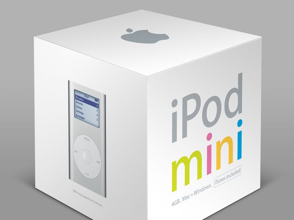
Remember those questions we mentioned earlier? Answer those questions. Revisit them and answer them again, this time with specificity. Who is your customer? How specific can you get here? Take a look at your brand persona and all the user personas that you’ve created. Drive it down to a specific person, your neighbour, your colleague, your friend or your sibling. The iPod Mini’s clean minimalist packaging style is a great example of how Apple finds its consumers.
Research, collect and collate
With all the information that you’ve obtained, look up Google and other key websites. Collect information of any kind – text, images, graphics, it doesn’t matter. Now, bring them all together to create a mood board. The more data you collect, the more ideas you will get on how to approach packaging.
Café Cuba is an interesting specimen to look into. While the coffee-flavoured soft drink is a commercial failure, its packaging attracted eyeballs. The brand wanted to take over the youth market and tapped into the collective consciousness of the modern Indian youth – carefree, hip and revolutionary. From the branding campaigns to their packaging, their design has been viewed as a “daring experiment”.

If you’re selling shampoos for teenagers, tap into their collective consciousness. What do teens love? Now, go deeper and be specific? What does the teen living next door love? What do the teens in the nearby school love? Do research, collect data and curate ideas that reflect their ideals.
Visualise boring data
The age of information has made one contribution to packaging design: tabular data. Many designers hate to put tables on their product or packaging and this has led to them visualising numbers and other data, from product ingredients to side effects to warning labels or other essential product information.
Nix the bad back
Another area where design flounders is the back panel. Designers at times consider the back panel to be copy-oriented. This however is where a difference can be made. Just look at what cereal boxes do on the back of their boxes. Not only do they have interesting titbits but also provide some entertainment (like a maze or a puzzle). Some cosmetics brands have also done it well.


Find the “hero”
Even if you sell the same hairfall control shampoo much like your competitors, there still is a chance to be different. Brainstorm with your branding team and try to find one thing that you could do that no one else’s doing. In 1917, Lucky Strike, a failing brand of tobacco came up with a new strategy: “It’s toasted!” Lucky Strike claimed that its tobacco was toasted and that made them a better choice for the health-conscious consumers. The thing is, almost every other tobacco brand either toasted or sun-dried their tobacco but didn’t think of it as a USP allowing Lucky Strike to capitalise on that claim. For a long time, the “It’s toasted!” tagline was prominently displayed on the cartons and boxes as well.
So, what distinguishes your product from your competitors? Does your shampoo not have sulphates? Is your cereal vegan? Is your car wax thinner than your competitors’? Bring that information into your product and your packaging, not as a footnote but as the “hero”. Find what sets you apart and shout it through a megaphone.
Closing the lid
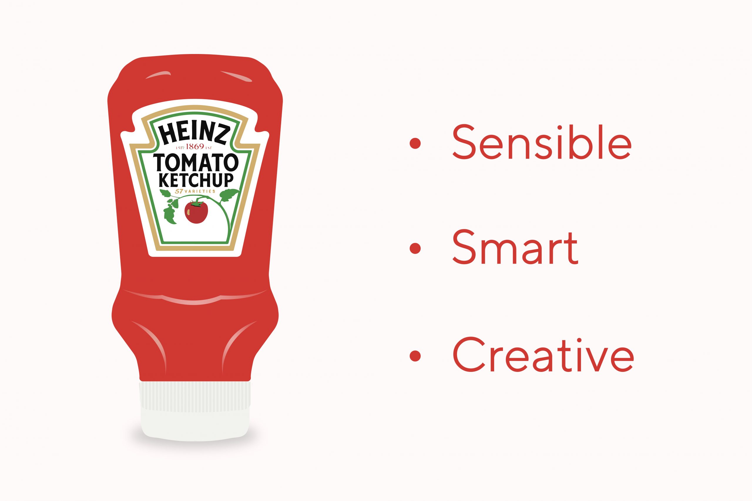
In our first blog on packaging design, we talked about Chik and the way they changed the course of the shampoo market with their sachets. Be it Chik’s sachets or Heinz’s upside down ketchup bottles, these products are made to challenge the norms and conventions that have been in place. They asked questions and found not just the answer but also a revolution.
When the upside-down ketchup bottles were easy to use, the customers never chose to look at the glass bottles again. Smart, creative and sensible packaging can not only make or break a brand, it can change buyer behaviour. Your product needs to solve problems not raise a new one.
Remember, if what you sell is important, what you sell it in is too.