Of all the things that are involved in a branding campaign, a critical one is packaging design. What does your final product look like? If you’re rebranding your product, how different is the product’s packaging from its predecessor. If your product is in its first generation, how different is it from its competitors? These are just two of the many questions, branding executives and designers ponder over when the next item on their list is designing your brand’s products.
You may wonder: how about we just slap a logo and a pretty picture on the front, text on the back and some pretty colours to go with… Shouldn’t be that hard…
Take a look at a typical supermarket shelf.
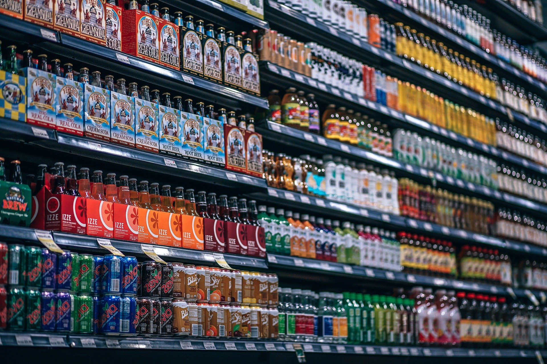
This is what your customer sees. In a lot of cases, the customer knows what brand to pick. Yet, when they are looking at something new – like hair volumizer or face scrub – they may not know which brand is good. Pantene or Tresemme may make competent shampoos. But, are their volumizers as good as their shampoos? Sometimes, your customer may be loyal to a brand but is just looking around for something new or different. This is where packaging design comes to play.
Nivea’s Teardrop
When Nivea wanted to launch their own milk-based face wash, they had a difficult competitor – Dove. They made the difference through packaging. They scrapped the tube that’s become an industry standard and went for a teardrop shaped container.
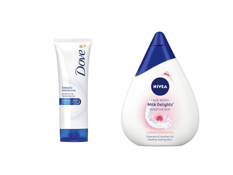
Why out of all shapes did Nivea choose a teardrop shape? They took a leaf out of the Diamond Salesman playbook. Diamonds are known for their hard-edged teardrop shape, which has gained prominence as an allegory for elegance. The teardrop shape depicts a bold and independent woman. Nivea’s face wash stands out from the rest because they are all tubes.
When you look at a thin tube and a wide teardrop, your mind begins to wonder whether Nivea offers more quantity than Dove. While a sensible shopper would compare the weights of both products, a majority of shoppers would go with what they see and take the product that looks like it offers more than the rest. This is Buyer Behaviour 101.
Why Is Packaging Design Important?
You’re selling a top-notch perfume. Why would you choose a rust-prone steel container when you can go for an elegant glass bottle? When your perfume is top-notch and is also priced in such a manner, your packaging must make customers desire to own one.
Apart from the material in which you package your product, you must also look at colours, fonts, text and graphics – all of which will go on the package – both the outer box and the product.
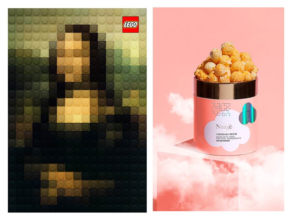
Design tells a story. Good design tells the same story in a better manner. Similarly, good packaging tells the story better. The above image has an ad and product. They both tell stories of their own. And, they do it well.
Where And How Do You Start
If what you’re selling is important, what you’re selling it in is too. Packaging design essentially is how the exterior of your product looks like. If you’re selling tomato sauce, what does your bottle look like? Is it made out of glass or plastic? Is it transparent or fully covered? What about the text and graphics? These are all considered when you begin thinking about packaging design. But, before we get to that, you’ll have to answer the following questions:
Question: What are you selling?
Coffee, toothpaste, perfume, soap, cold pressed juice, ready-to-eat kale salads… What are you selling?
Question: Whom are you selling it to?
Once you have your product, you’ll have to determine who your core target audience is. If you’re selling coffee, you might think that you have a wide audience, but you can continue to refine it. Sunrise from Nescafé is positioned as a middle-class coffee. Their containers have a simple and compact appearance and are available in different sizes. Davidoff, on the other hand, is aiming at the high-end coffee consumer. They sell their coffees in one 100gm cylindrical glass container that has a sleek design.
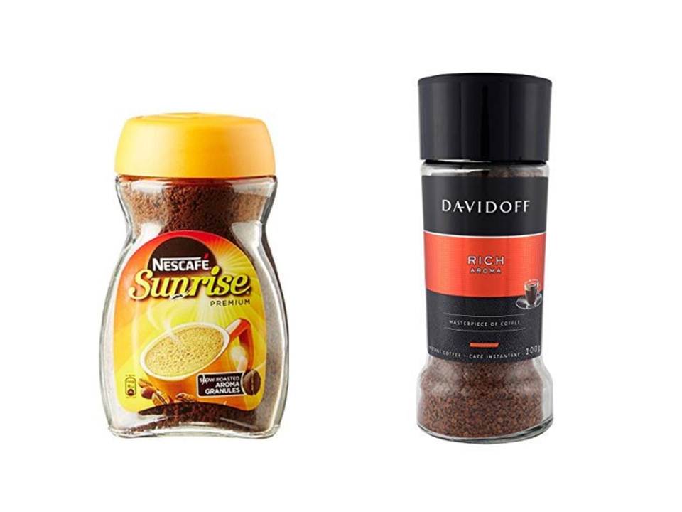
If you’re selling coffee, where does your brand appear on the Sunrise-Davidoff spectrum? Is it closer to the affordable and simplistic Sunrise or is it in the proximity of the stylish and high-priced Davidoff? There’s a reason why Dairy Milk chocolates come in a simple wrapper while a Lindt chocolate bar has a box-style packaging.
Is your product aimed at kids? Is it aimed at teens? Senior citizens? Pregnant women? People with hair problems? Drive it down and find the core audience for your product.
Question: Who will buy it?
Now that you know who your core audience is, you need to ask yourself, “will a kid buy my kid-themed product?” Chances are that parents and adults would purchase these products for their kids or younger siblings.
If you are selling a special kind of oil that can stop hair loss, is it safe to assume that only the people associated with hair loss would buy it? When it comes to products aimed at pregnant women, who would buy it? Your product could likely be purchased by a pregnant woman or her husband or siblings or parents. Making big decisions like these will help make your design appeal to a wider audience.
Question: Where can they buy it from?
Are your customers going to buy your product from a supermarket or do they order it online? A recent study found that a good number of online shoppers are keen on buying something that appeals to them. So, if you plan on selling entirely online or are an online-first brand, you’ll need to ensure that your design too is exceptional.
Earlier, we had shared a photograph of a supermarket shelf. Take a look at it again. If you plan on selling your product through supermarkets, this is how your competition would look like. How can you be different and at the same time not alienate people. If you sell products for senior citizens, you can’t look like a hipster. You’ll need to look more dignified with bigger font sizes and lesser text. The only trouble is that a lot of your competitors are doing the same. In times like these, you’ll need to study your competitors and see what you can present that they haven’t or, how you can do it better than them.
These are just some of the important questions that you need to answer. The best way to get about this is to bring your team together and go around asking and answering questions. Try to be specific.
Question: When a consumer looks at your packaging, what’s the one thing you want them to remember?
Question: Can I sell my kids’ product in a glass bottle?
Question: Can I use a simple paper wrapper to sell my artisanal chocolate?
The more questions you ask and answer, the better your packaging looks.
Be Chik. Be Inventive.
Our objective in this essay is to help you understand the basics of packaging design and why it is important to not ignore packaging design. With an original idea, you can pave the future of your industry. Chik shampoo began selling their products in a 5ml sachet that could be bought for just 1 rupee. This was because the brand aimed at connecting with consumers in the lower end of the socioeconomic line.
Shampoos at that time were sold in plastic cylinders and tubes (with a minimum quantity of 100ml), and were seen as a luxury than a commodity. After Chik’s sachets became a huge success, other brands ventured into selling by sachets. Today, more sachets are purchased than bottles and cylinders, not only because it’s cheap, but also because it’s convenient. Sachets are the best choice for travellers and for those looking to try out a product for a short amount of time.
Your customer’s experience with your product will decide their loyalty. But, in order to get them to choose your product, among several others, you’ll need to look different and look better.
Still confused on packaging design? Give us a holler on Facebook or Instagram and we’ll get in touch with you. You can also view our recent packaging designs here.