Welcome to FontFirst, a brand new content series where we dive headfirst into the world of fonts and share some of the best fonts for your brand. On our first edition, we look at fonts that would be a great fit for IT startups.
IT startups commonly maintain a professional and sometimes fun brand voice. If you aren’t sure on what your IT startup’s brand voice is, we suggest that you check out our earlier post on brand voice. A professional voice is the right choice for any corporate wannabe. Today, typography is fast becoming the major brand element of startups including vastly successful ones such as Uber and Spotify. We’ve sourced ten great looking typefaces that would best suit your IT startup – be it in the logo or the website or even as part of your business collaterals such as visiting card, letterhead, envelopes, etc.
These fonts cast haloes of modernity, professionalism, authority, vibrancy and fun – each in its own way. Let’s dive in!
Click on the links below the descriptions to download or purchase your preferred font.
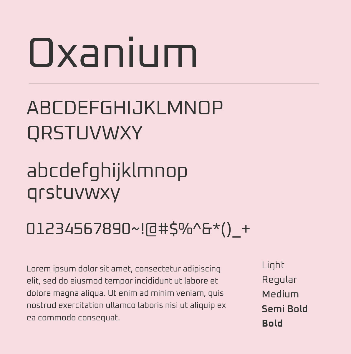
Oxanium
Square in shape and futuristic in style, Oxanium looks to the future much like your IT startup. From ensuring legibility with its innate strokes to the angled cuts and boxed figures, Oxanium can provide style and charisma to your brand.
Get it now
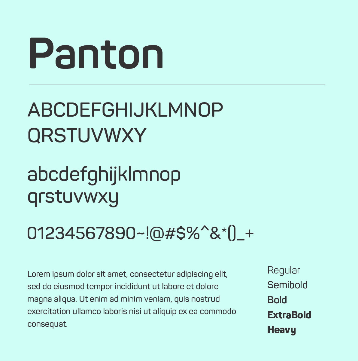
Panton
From legibility to kerning, Panton checks all the boxes required to be a truly professional font. A softened geometric design makes Panton a great typeface to use on any medium.
Get it now
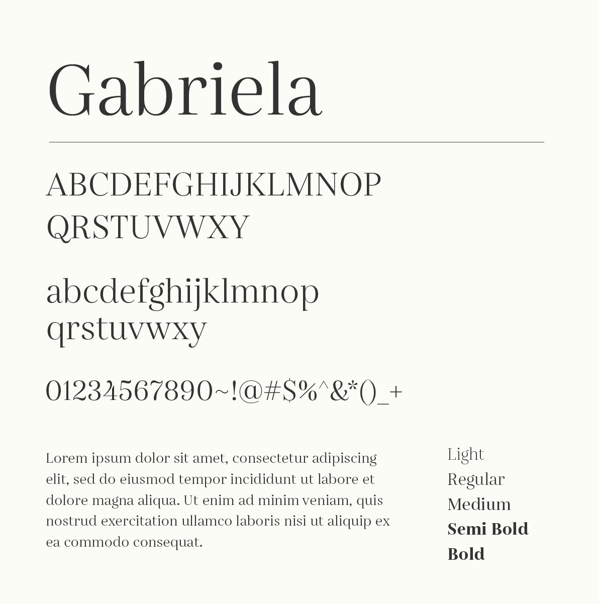
Gabriela
Gabriela adds oomph and playfulness to your brand. Versatile in nature, Gabriela is inspired by early latinotype fonts and is an excellent choice for headlines and long-form text. With 36 styles, Gabriela offers a comprehensive font package too.
Get it now

Neogrotesk
A versatile and functional typeface with a centrist appearance and a Latin heart, Neogrotesk is a heavy duty typeface with multiple typographic features from alternates and ligatures to old styles. Designed by Luciano Vergara, Neogrotesk is a great choice if you want a professional halo that also spells fun. The boldness of the typeface ensures that you are never taken away in one direction or another, remaining neutral all the time.
Get it now
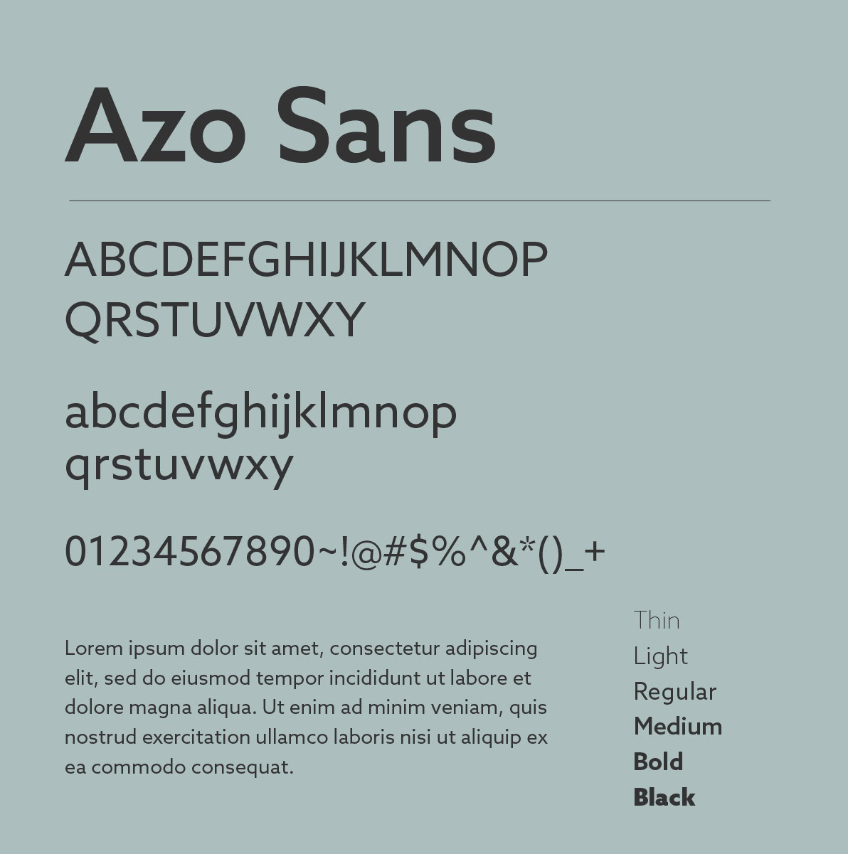
Azo Sans
Inspired by the constructivist typefaces of the 1920s, Azo Sans is a sans-serif typeface that blends a geometric form with a humanistic touch. The soft geometry makes the typeface pleasant to read in longer formats. Azo Sans adds a vibrant, professional halo to your brand.
Get it now
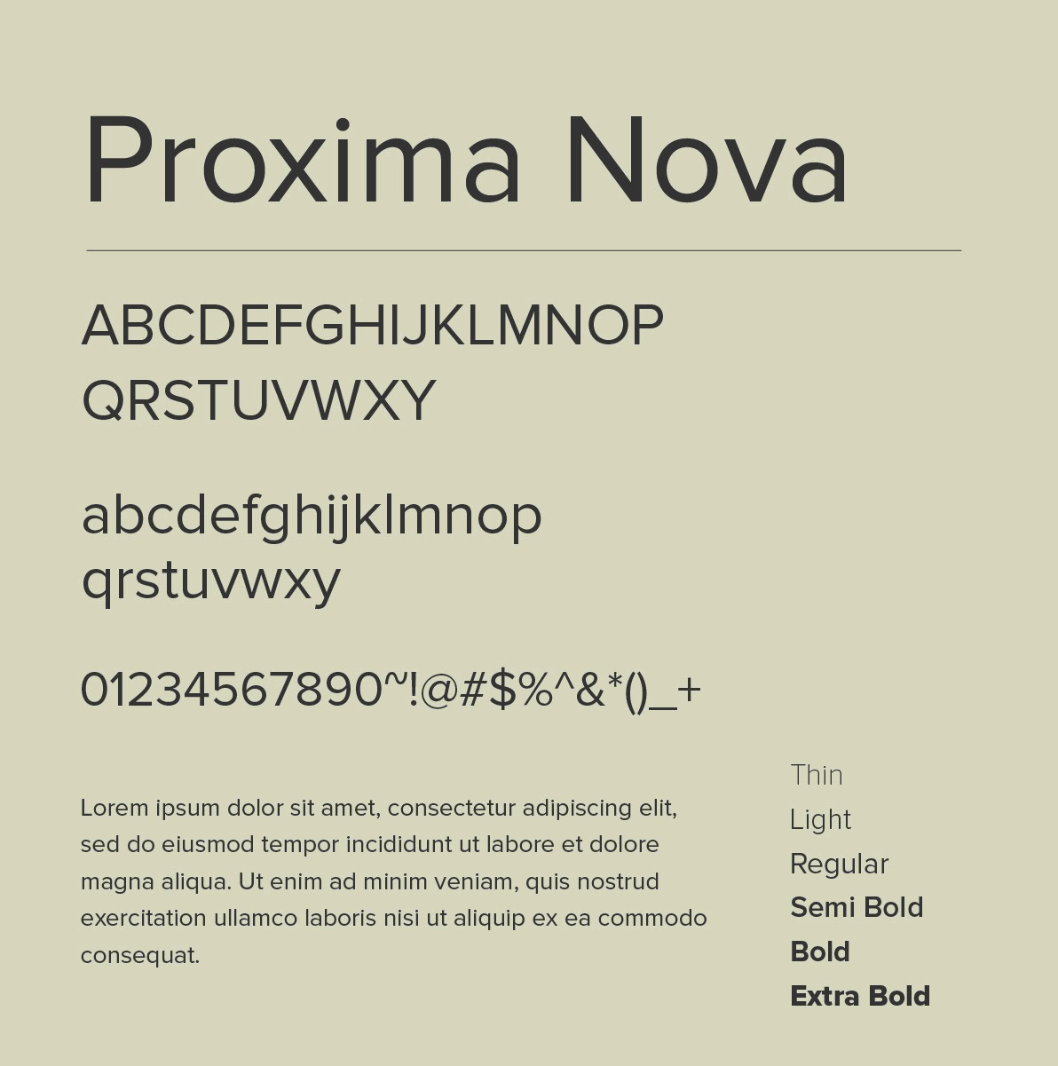
Proxima Nova
Proxima Nova was released in 2005 and is a remodelled version of Proxima Sans. This condensed, sans-serif typeface is extremely popular and has a geometric appearance. This typeface is omnipresent across the web and has been used by web giants such as Twitter. It gives your brand a sleek and professional look.
Get it now

Bebas Neue
Another free-for-all font, Bebas Neue is a sans-serif typeface that is extremely popular. Known for its weight, clean-cut lines and elegant touches, Bebas Neue has been used across mediums and gives your brand a stylish, professional look.
Get it now
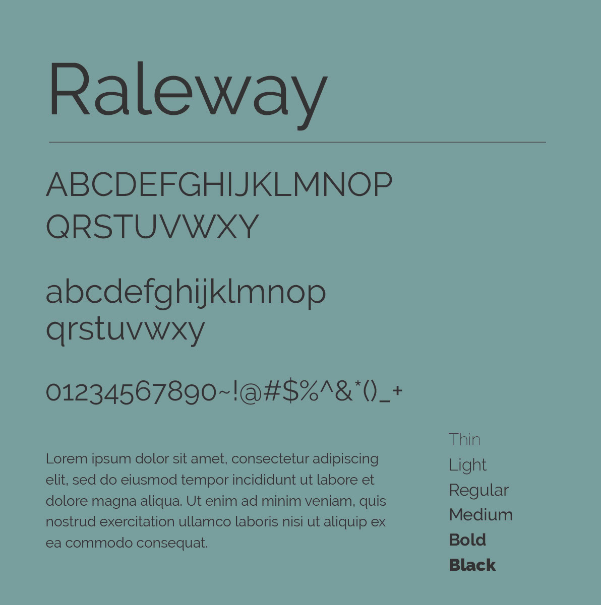
Raleway
Raleway was created by Matt McInerney and is a thin sans-serif font with alternate glyphs. Elegant and best suited for headings, Raleway became popular as a stylistic alternate inspired by more geometric sans-serif typefaces.
Get it now
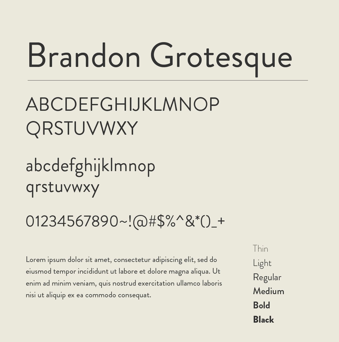
Brandon Grotesque
Brandon Grotesque is a sans-serif typeface that was released just a decade ago. Often used for its heaviness, the typeface projects a sense of warmth while being able to retain its signature corporate look. Brandon Grotesque can be used in creating contemporary logos due to its rounded, complex style.
Get it now
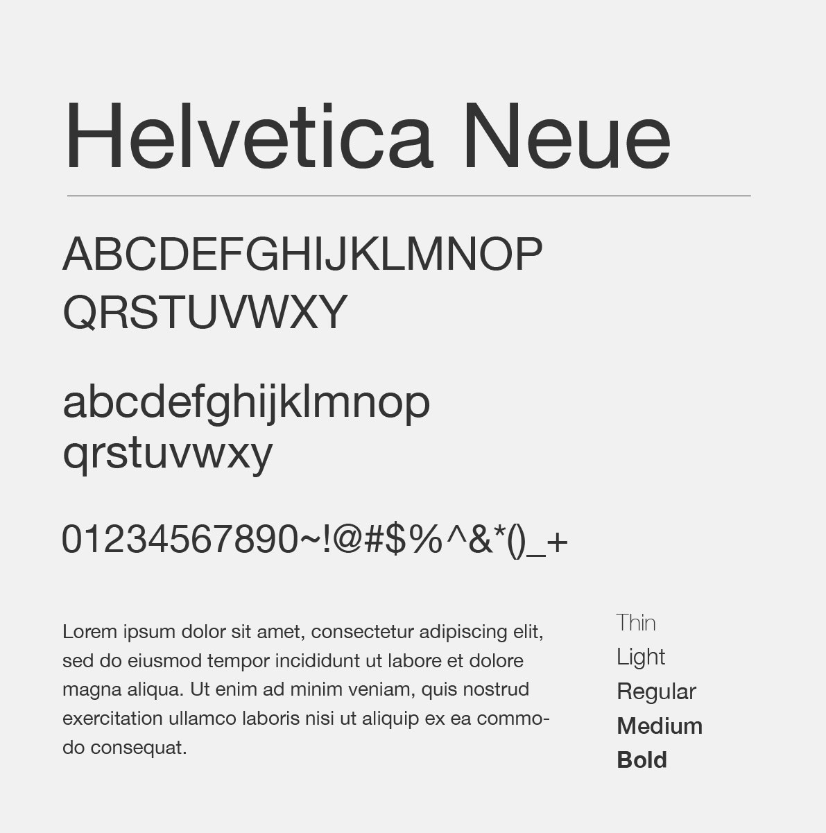
Helvetica Neue
The god of all corporate fonts, Helvetica is a popular sans-serif typeface developed in 1957, owing its popularity to its alliance with Swiss design. Helvetica also has its detractors too. The uncomfortably tight spacing in this font is often seen as its biggest issue. In 1983, the typeface was reworked and introduced as Helvetica Neue which carries the older typeface’s charm and professionalism.
Get it now
You might wonder about the need to have a good font as there are those who believe that a strong message and visual style might be enough. However, fonts provide a certain detail about yourself and your startup. A rigid font makes you appear authoritative or strict, a comfortable sans serif font like an Azo Sans or Glacial Difference makes you seem fun but professional. However, choosing a script font or even something as basic as Comic Sans MS can backfire and make you and your company appear amateurish.
Whenever a consumer requires something, they go through their mental rolodex of brands: first logos, slogans, then advertisements and promotions, then past experiences and finally, the product. As the visual representation of a brand, your font has the potential to communicate and reinforce your brand’s core value by appearing neither too strong nor too humanistic. While fonts aren’t that easily recognisable, every one of them has a certain charm to themselves.
We hope that you’ve enjoyed reading this post as much as we enjoyed creating it. If you’d like our expertise in finding the best fonts for your startup, please get in touch with us through our website or via Facebook or Instagram.