A union of grace, charm and unbridled elegance
How refined design and vivid thinking brought an event planning brand to life.
When one of the best wedding planners in Italy and a relatively new but passionate planner in India came together to start their own company, it was for the lack of a better phrase, a match made in heaven. Sukkrish Aadds came onboard to create the brand from the ground level; right from the name to core idea to identity and design.

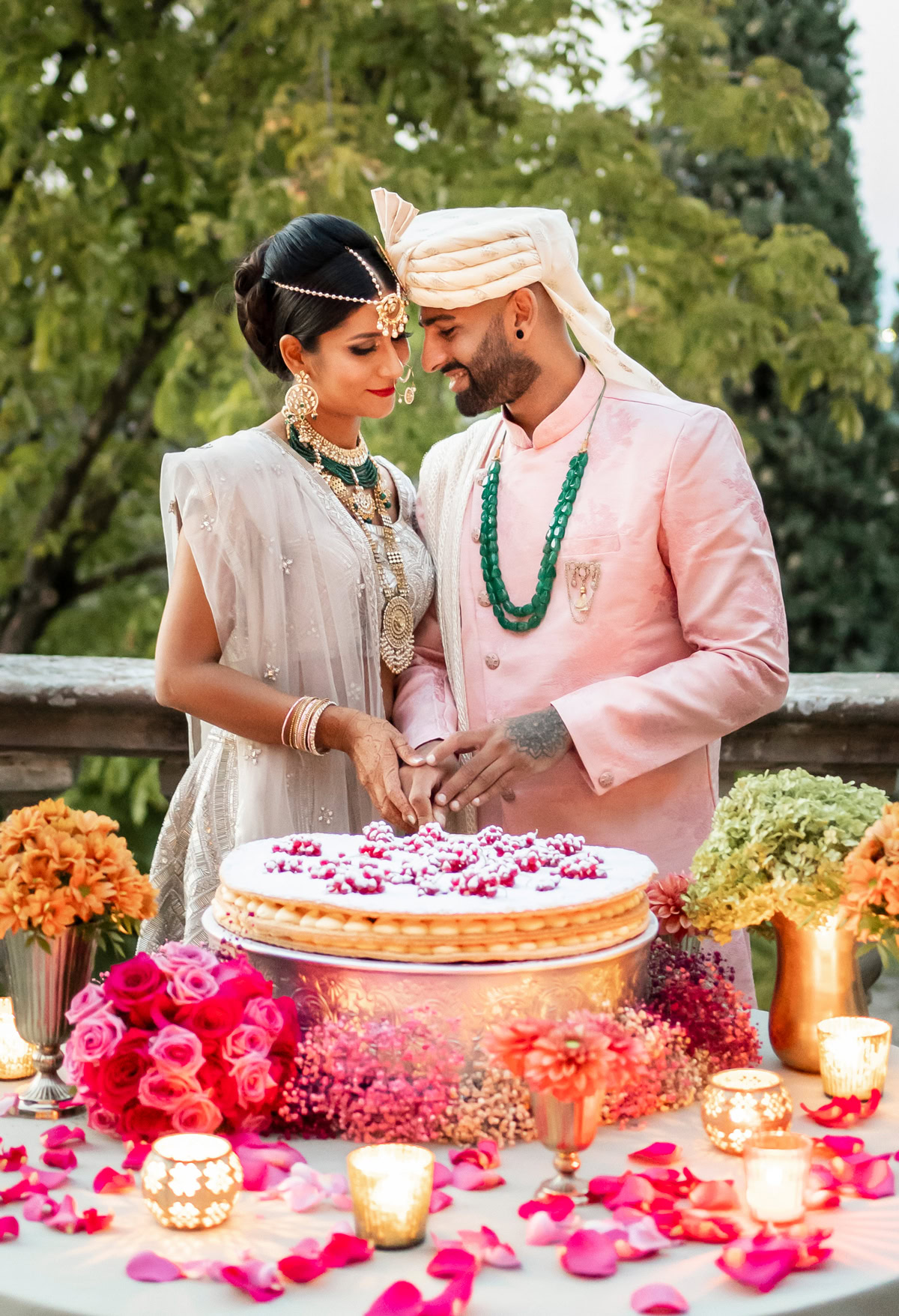
With the market for destination weddings opening up in India, this was the best time to be a wedding planner. While the new brand was offering more than just weddings, it was nonetheless their raison d’etre. The current market scenario enabled us to import modernity and elegance into every aspect of the brand while dependability also became an emotion that needed to be evoked.
“Even if the customers cannot travel, we wanted to bring the world to them and help create their dream wedding.”
— Reshma, co-founder

A fusion of two identities
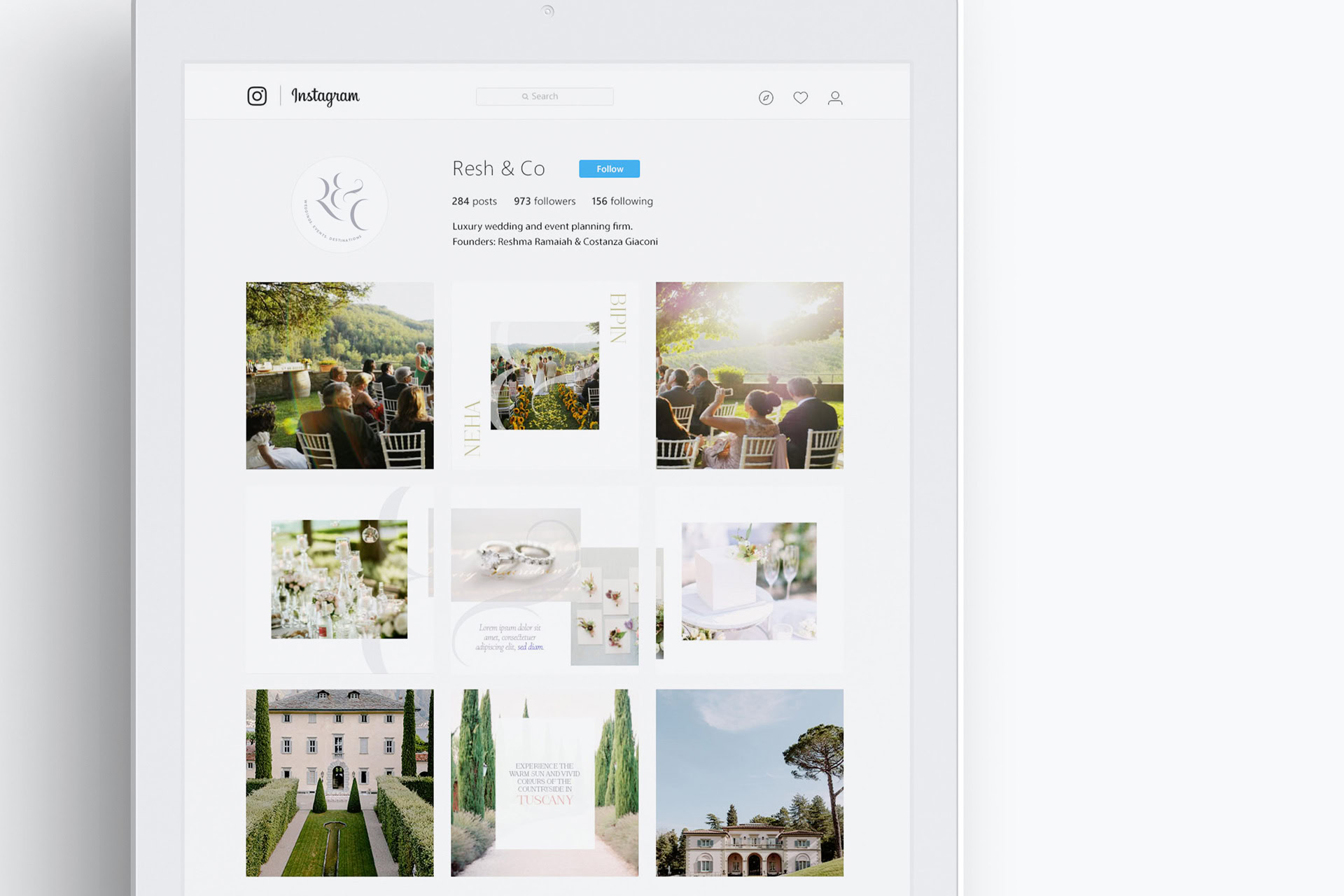
One Indian, one Italian, altogether, a fusion of two cultures and identities. With such prowess behind the company, the name needed to reach out and help accredit the brand as a dependable one. This fusion of identities led to the name, Resh & Co, the names of the two founders. It’s clean, feels homespun and is not an obscure wedding term. With the name in place, we arrived at the final logo after several rounds of exploratory work.
A serif font with slightly curled ends was selected for the logo as it brought flair to a formal tone. The tagline is neatly tucked under this elegant logo in a simple sans serif typeface. “Every little detail counts” was their mantra and it matched their core idea very well.


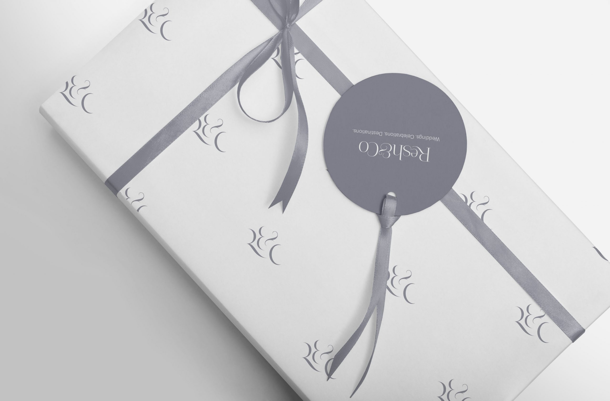
A motif that composed of the first letters of the names of the founders (R and C), along with the ampersand was designed. The curls along with the font’s natural thinness brought in Parisian elegance and nouvelle modernity. The tapering ends of the serif font were omitted and the whole unit was tightened into a circular format, appearing as though stencilled.

The colours that run the show
In any wedding or event, the colours run the show. The same applies to a brand. Having established a wave of lushness with the logo, we took the same approach to arriving at the brand colours.
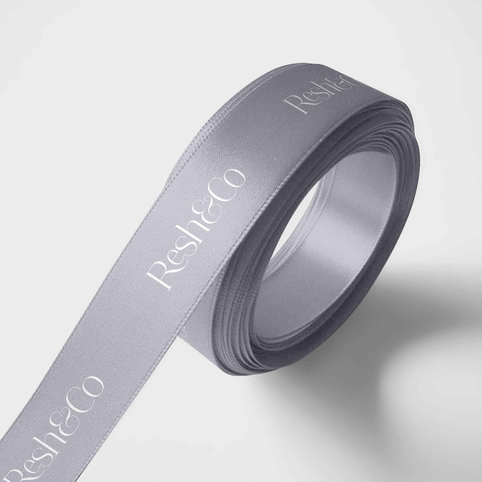
Grey, white and black formed the primary palette while royal shades of blue and green and earthy tones such as brown and beige formed the secondary palette.

Overall, the palettes draped Resh & Co in a serene and muted glow. The palettes also help bring the brand’s website to life where muted sections are followed by bursts of vibrancy.


A walk down the aisle of communication
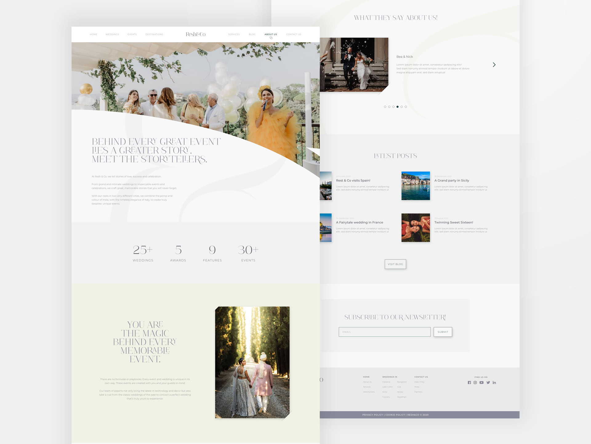
With a tagline like “Every little detail counts", we positioned Resh & Co as a brand that’s granular and in-depth when it comes to throwing events. Our communication strategy was modern, restrained and at times, witty with alliteration and literary devices. The communication strategy we put in place was all about subtlety, grace and allegorical elegance. This is especially omnipresent on their official website where a stunning and refined user interface presents the brand in a dignified manner.


The language of fun and joy
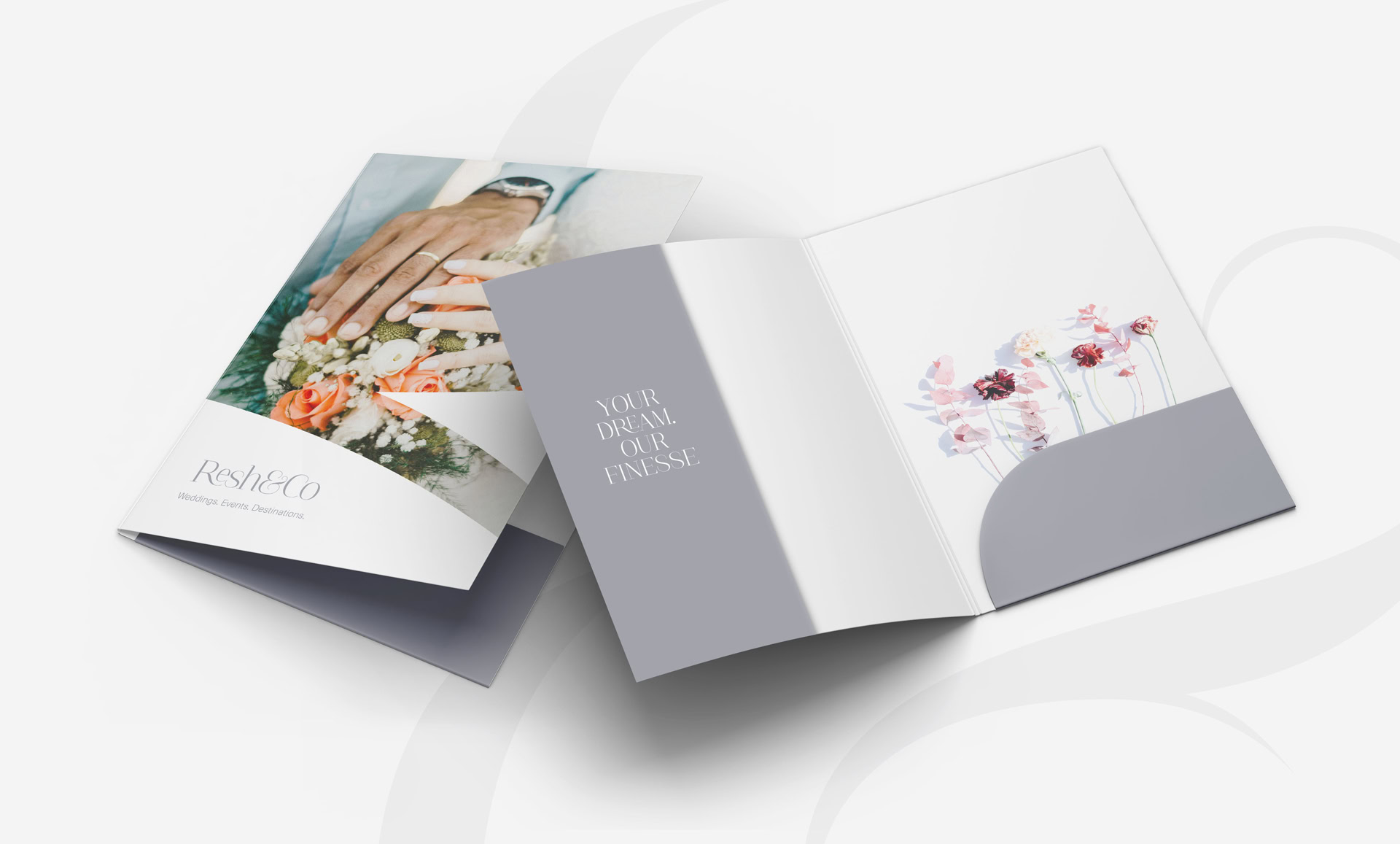
Our team also designed a comprehensive set of collaterals that showcase the various elements and details that come together to create the perfect event, giving attention to the little things that matter, thus being in tune to the brand’s tagline.
The individual letters from the motif take the form of containers for these elements and daintily cut the images into curved sections. All the work we did for Resh & Co hammers home the message that any large beautiful piece is just a number of small pretty pieces brought together by experts. With the language in place, the core idea truly comes alive and so does the brand, Resh & Co.

The digital slice of cake
We designed the Resh & Co website where the newly minted design language translates seamlessly and creates an ebullient symphony of types, colours, motifs and other elements, much in the way of a Mendelssohn orchestral piece. By blending images and videos, the Resh & Co comes alive with elegance and warmth.

Devices united
The website was also harmoniously adapted to suit all devices with a more approachable layout. The use of formal fonts enhances the device-viewing experience. Simply put, the website looks as elegant on any device as it does on PC or laptop.