
BRANDING / MOBILE APPLICATION UI & UX
HPYHRS is the young pope of app store. Trying to bring people together in the quest for good times, aka, Happy Hours.

element derivation
With the intention of resonating with the young vibe, we developed a brand identity which is youthful, bright and has a whimsical personality. Our mood board reflected a myriad of vibrant colours, neon signages, glass reflections and muted pop art iconography.
branding collaterals
Our bold word mark, with a simplified connotation of Happy Hours adds a touch of whimsy and works perfectly with our colour palette and usage across various platforms.
The slap of verbal stamps along with ideograms forms a strong visual language.


interaction designs
User Interface design of HPYHRS began with two simple questions:
How can we build a delightful discovery process?
How can we make it so user-friendly that it can be used even by an intoxicated user?
#theuserisdrunk
user journey map
After mapping the needs, goals, and expectations of users, we were at a place where we could introduce customer delight into the user journey. We started small, and introduced three basic principles pertaining to answering their questions, problem-solving process, and helping them reach their goals. We achieved it by making every interaction with our users real, warm and welcoming.

wireframes
visual research
After building the wireframe, the next step in our process was to build the visual aesthetics of the application. We started exploring different moods and approach for the right composition. Our mood board reflected a myriad of vibrant colours, neon signages, glass reflections and muted pop art iconography.
typography
color palette
Blue
CMYK:78,52,0,0
RGB:45,126,255
HEX:#2D7EFF
Neon Green
CMYK: 61,0,69,0
RGB: 0,253,137
HEX: #00FD89
White
CMYK: 0,0,0,0
RGB: 255,255,255
HEX: #FFFFFF
Black
CMYK: 74,65,60,79
RGB: 33,33,33
HEX: #212121
onboarding
The onboarding screens, while providing a clear picture of the application – also integrates gamification into the user learning process.
While users are getting to know the features and elements of the application, the small quiz questions help the application curate a personalised dashboard for them.
screens
HPYHRS homepage is the gateway to the world of delight, curated for easy discovery. It focuses on experience, makes sure the content is easy to read and scannable, expediting the decision-making process.
It goes by the mantra, ‘give users what they want – and a little more!’


cards approach
We followed a visual language based on cards, providing attention to detail for a multitude of elements across the application.

filters for personalised results
The filters were a byproduct of hours of brainstorming and survey sessions dissecting the various metrics over which users make their choices.
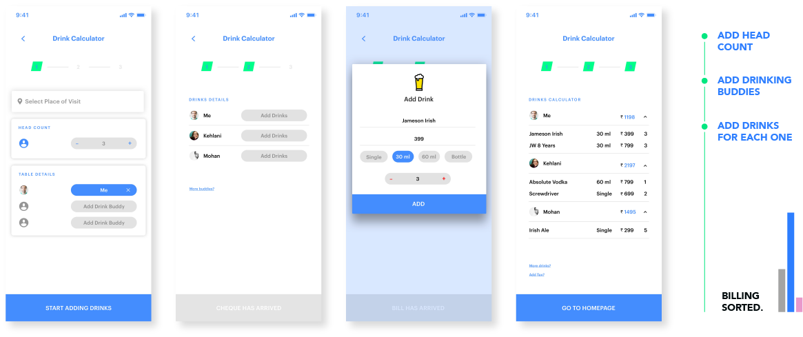
drink calculator
Solving a fun problem
We stumbled across a fun problem during our research phase.
Apparently, drinking and math didn’t go well together and often lead to bad experience in group outings.
We took on the challenge to solve the problem. We devoured the menu options, to curate a simple solution which would just require adding members and number of drinks for each member and the app will curate the individual amount accounting for each person.
ready for launch

Pushing the application to production, we developed several marketing collaterals, along with the general checklist required by the app store.